As a public organisation, the Tax Administration wishes to serve citizens and organisations to the best of its ability. The goal of the update was to help users find the right information on the website.
Citizens may find taxation hard. The Tax Administration wished to update and improve the look and user experience of its Vero.fi service to be more communicative and visual. Another goal was to streamline and clarify the self-service process to make digital services easy for customers to use and understand. This would reduce the need for citizens to contact customer service.
The Tax Administration had already accumulated plenty of data related to usability and customer insight that it wished to see reflected in the final version of the service. In addition, the Tax Administration has invested in high-quality content design to help users better understand different instructions.
Results
The customer-oriented update of the website has successfully progressed towards the goal of users finding information more easily and independently.
- The updated website serves the customers and customer service agents of the Tax Administration better.
- Customers find the contact information pages easy to use and find the self-service channels more often.
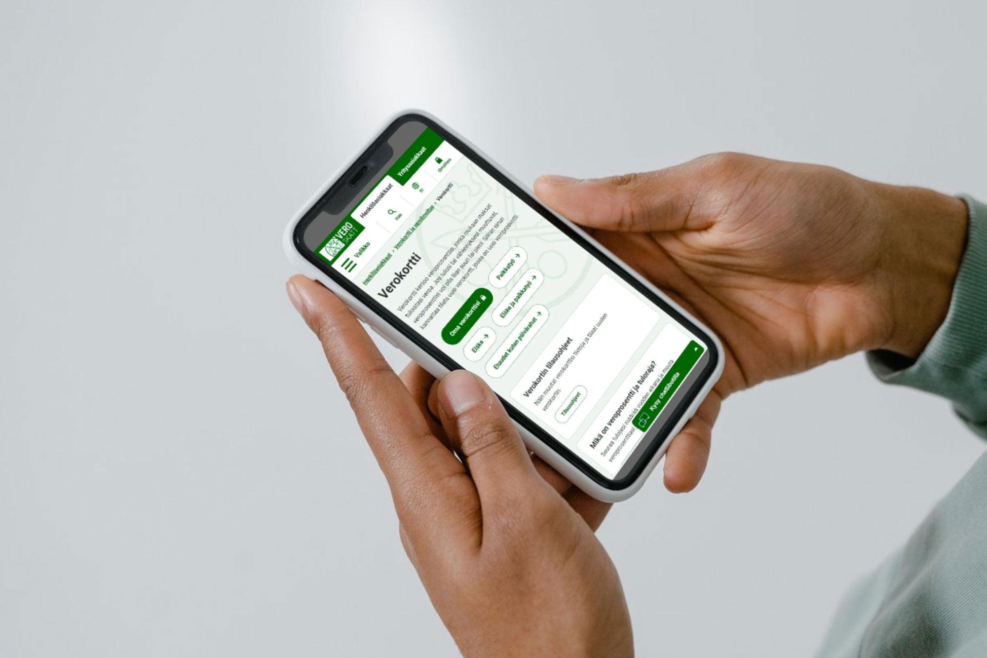
- Navigation elements are now easier to find than before and used more frequently. Navigation contributes to users finding the right information.
- People find the tax card pages more readily: views have surged by 35 per cent.
- The Tax Administration’s digital services won the Software Finland Digital Service of the Year award in 2024.
“Our goal was to make self-service attractive for citizens and reduce customer service workloads. We aimed to present information in a more intuitive way for citizens to find and to introduce a less heavy overall look,” says Jyri Niemi, Creative Director at Solita.
Solita has been the Tax Administration’s website maintenance and development partner since 2017.
Taxes aren’t complicated, all questions can be answered
Tax Administration services are used by millions. There is no doubt about the great importance of them being easy to understand and use.
“We quickly realised that if someone doesn’t understand something, they won’t be able to resolve their issue and will contact customer service. Even minor adjustments and corrections in wording can make a big difference, and here the people producing the content of the Tax Administration have done an admirable job,” says Tiina Lönnfors, Senior Service Designer at Solita.
The Tax Administration aims to serve citizens to the best of its ability and wants to showcase that tax money has been well spent. The main goal of the update was to help users find information on the website independently. This was achieved through improved usability with visual and structural enhancements, highlighting key user journeys from the front page onward, and a visually harmonious design that helps users focus on resolving their tasks.
“The previous site structure was that of a rather conventional information website. Now the user experience is easier. For example, ‘solution wizards’ are activated more often to pose additional questions and offer alternative solutions to users. This helps users progress with their tasks,” says Niemi.
“At the same time, we wanted the service to be visual and have a comfortable atmosphere while retaining the fact-based foundation. We worked hard to find the best combination,” says Lönnfors.