Without going into too much technical stuff, I will start by quickly covering the different points of integration that exist in Planacy for the BI tools. Then I will go through each level of integration and talk specifically about what to consider on each level and I will finish with some thoughts on built-in charts and where I think Planacy could benefit from some more integration points!
Blog

What BI dashboards to use where in Planacy?
Mats Hedberg
Published 07 Jul 2022
Reading time 6 min

Planacy loves BI and especially the tools Tableau, PowerBI and Qlik – all at the same time or separately. This article covers what kind of visualisations are suitable to integrate and where in a Planacy solution.
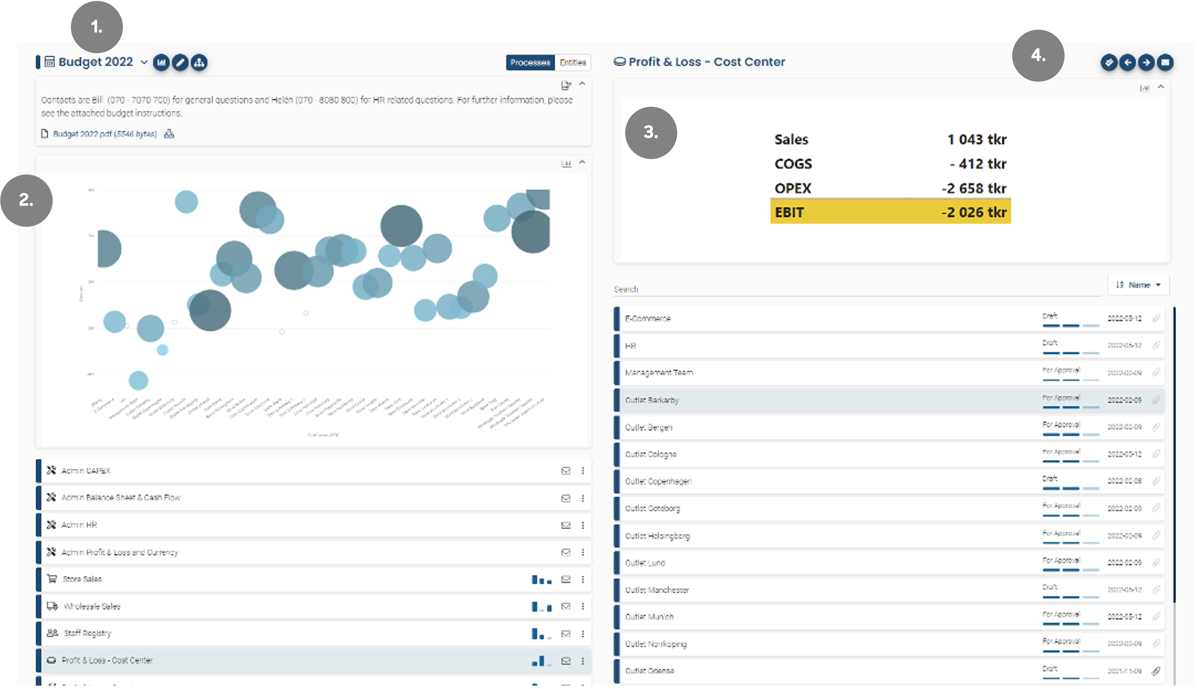
- The main menu. This integration point is for an overview dashboard with usually no filters. This integration point is a menu type and opens in the same frame or a new browser window.
- This integration is on the same level as #1. But this integration is embedded in the solution.
- This integration is on level 2 and is used within a process and is usually filtered on the process entity. In this example, we see a short P&L for the “Outlet Barkarby”.
- This point of integration is on the same level as #3. But this integration is of type menu and opens in the existing frame or a new one.
To shift between an integration being embedded, included in the existing frame or shown in a new frame is really one click in one setting.
If we select “Embedded” the integration is shown within the tool and “Menu” means the integrations is shown in a frame.
If we enter the process “Profit & Loss – Cost Center” and then click on the entity “Outlet Barkarby” we will find the next integration point level (level 3).
The blue numbers in the “Actuals 2021” column are an actual link to a PowerBI dashboard where you can see a breakdown per account on your invoices. This is a very powerful example of the lowest level of Planacy – BI integration where you easily come down to transaction level from your FP&A tool.
I hope you now have a common understanding of the three levels of BI integration there are in Planacy. Let’s go through each level of integration in more detail.
Level 1 integrations
On the first level of integration, you really want to display some overview data. It might be a trend comparing Budget 2022 with the first forecast.
One can also build a dashboard that displays the key KPIs such as profit margin, personnel cost over Revenue or similar.
A word of caution here is that I have seen companies link from the level 1 integration to for example a complete P&L in BI and I personally think that this is a way of integrating into something nitty-gritty. My advice is to use BI as a complement to Planacy and integrate to small super clear visualisation that really adds value to your budget numbers.
Level 2 integrations
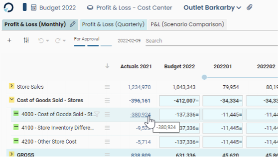
The main difference between level 1 and level 2 is really the level of detail, this level is connected to one process and is usually filtered per entity. This integration is an excellent way of quickly getting an overview of what expectations we got on a certain entity. Good examples of visualisations here could be a condensed P&L that is shown in the integration points picture. Another example can be a KPI or a Waterfall chart.
The important thing here is to utilise the filter function in the integration to only view data from the selected entity.
Level 3 integrations
On the lowest level of integration, you are down on individual numbers per account, per month, per whatever dimension you input your budget on and what you normally want to display here is actual vs budget, comments made on row-level or something else very detailed. In my mind, this level is often overlooked in a Planacy project but this is where you can really get the benefits of two worlds where Planacy gives you the input possibilities and the BI gives you drill down functionality from detailed to super detailed, in this example, I show Forecast vs Actuals LY for account 3000 for entity “Outlet Barkarby”.
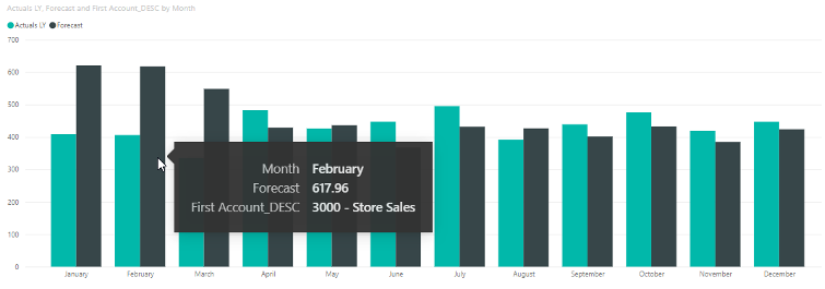
From here one could imagine a continuation of the visualisation where the separate transactions are displayed when you select a single month. Suitable charts on this level can be bar charts, tables or line charts.
Planacy built-in graphs
Please note that it is possible to get some basic analytics out of the box in Planacy. Here is an example of the detailed P&L process where you right-click on the hamburger menu and select “Analyze”. This results in a web chart in the top right corner of the screen.
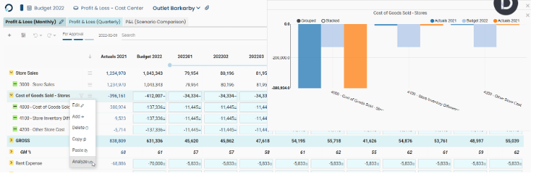
You can select which expressions will be included from the template by using the Show in graph checkbox on each expression.
I can see why this is done to give small accounts without a BI tool the possibility to show some graphs, but the functionality is rather limited, and I strongly suggest projects to focus on good Planacy – BI integrations rather than relying on the built-in charts.
Admin integration
Since everything is in the Planacy database, the possibilities to visualise data are endless. In addition, there are things that an admin would be interested in such as user authorities, logs, ETL errors etc. One idea (not implemented just yet) would be to have a fourth point of integration in the Admin overview (accessible from the cog wheel in the top right corner).
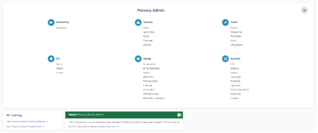
Wouldn’t it be nice if there was a possibility to integrate to BI somewhere here? Making it possible to visualise Admin-specific dashboards. One could for example show a doughnut with a number of entities in different statuses.
And when a status is selected, you’ll see all entities in that status giving you the possibility to link back to that process in Planacy.
Another possible dashboard is a “User overview” where an admin can analyse users per role and process to for example troubleshoot difficult authority issues and find out who has access to what.
Another way of solving this would be to make standardized admin graphs like the ones we saw in the built-in charts chapter above. This could work since all user and authority data is stored the same way in all Planacy installations. I personally believe though that one ought to use Planacy for input and a BI tool for output and a better way forward would be to provide good example dashboards in PowerBI, Tableau and Qlik.
Conclusion
While writing this article, I realised that one can visualise data in so many ways, but I think the key takeaways from this article should be:
- Go for small and descriptive graphs rather than complete dashboards
- Use all 3 levels of integration with BI in Planacy to create an FP&A solution that helps the user input accurate numbers on the right level of detail
- Use BI in Planacy as a supportive tool to emphasize the important numbers (KPIs)
- To decide what points of integration you need in Planacy one needs to know how the business is measured. In other words, what are the company key KPIs and then build your Planacy BI dashboards based on these KPIs.
- Start your BI journey in Planacy early in the project otherwise the risk is that it’s never done
I hope you enjoyed this small showcase of how I think Planacy and BI should coexist in a Planacy solution. Don’t hesitate to reach out if you have questions, comments or simply want a demo.
Author
Mats Hedberg