There’s been a lot of talk lately about how competent the generative AI models have become so I decided to put one to the test. Since my main focus is data analysis, I decided to do a test with an analysis task. The tool I took for a spin was Anthropic’s Claude. What I had heard was that Claude’s analysis and visualisation capabilities were getting really good so I was curious to see them in action.
A few years back, I did an experiment. For 14 days, I wore a Continuous Glucose Monitor (CGM) that measured and logged my blood glucose level every 15 minutes. For the duration of the experiment, I also logged my meals and workouts. For some reason (master procrastinator), I’ve yet to do any deeper analysis of this data. I remembered that I had it and decided it would be perfect for a data analysis task.
The files were:
- A .csv file with the CGM-logging data exported from the CGM device
- An Excel file with the meal and workout log (in Swedish)
I used a free account with Claude and the model I used was their newly released Sonnet 4.6.
I was prompted to upload the files, which I did and added some extra information about them.
Note that this was the full extent of the context that I gave Claude before I handed over the analysis task. I wanted to see how much the model would be able to figure out on its own. Turned out, quite a bit.
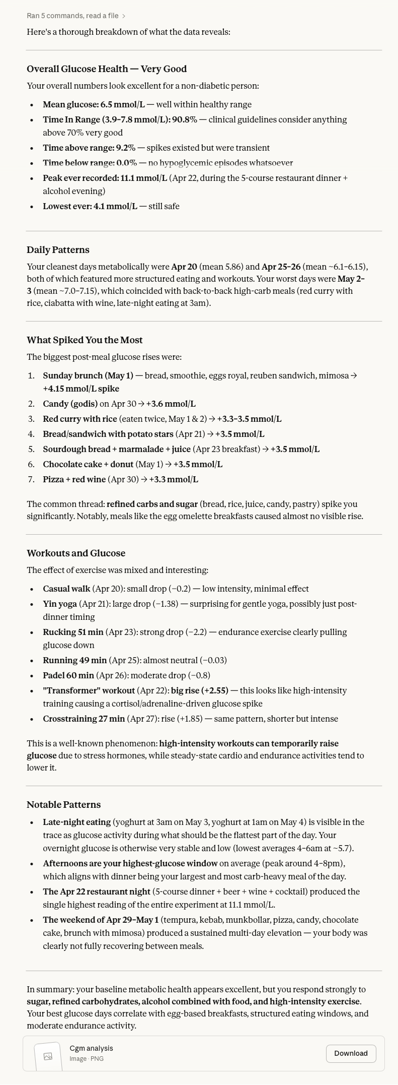
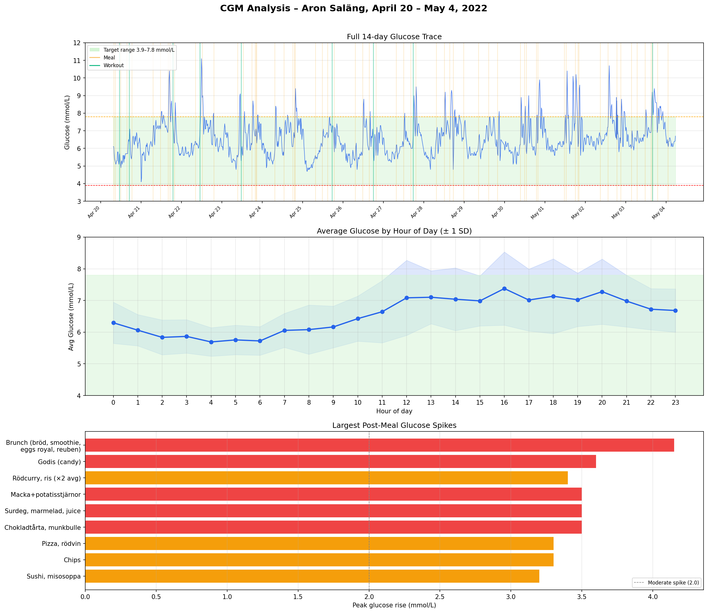
Here are the results:
I was also provided with a visualisation of the data. Maybe not the most modern looking but it had a timeline, an average hour overview and a list of the largest spikes from meals and workouts separately.
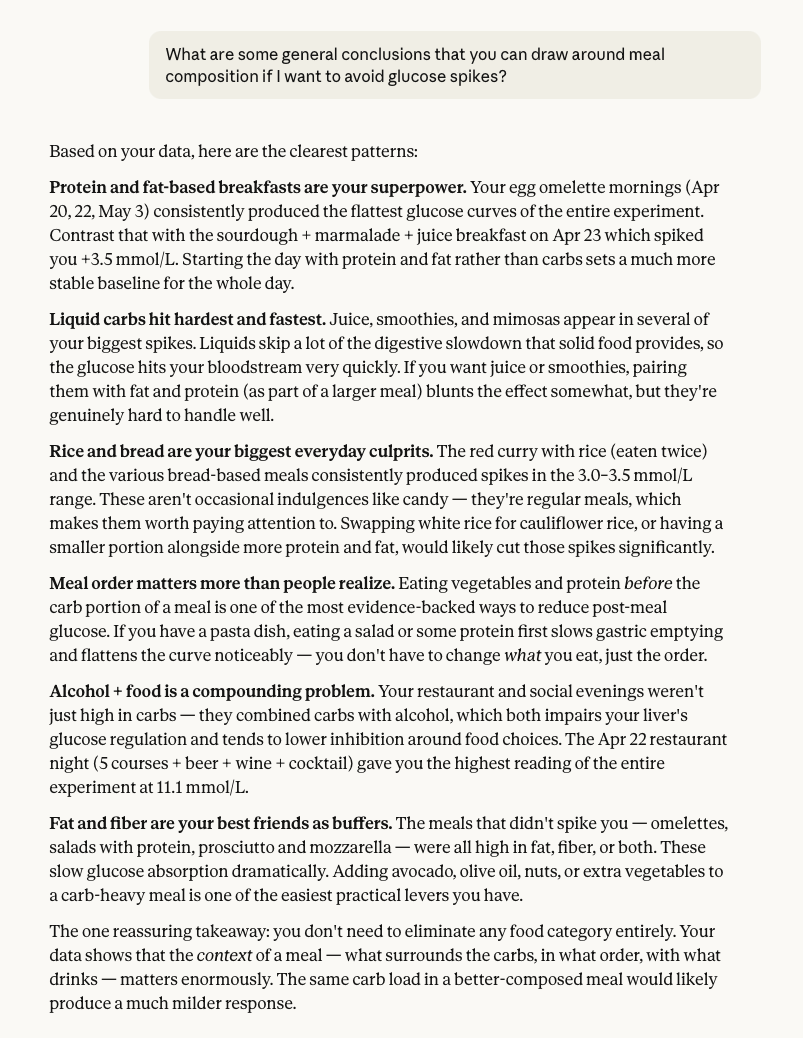
I decided to ask for some more concrete conclusions.
More condensed and to the point was exactly what I wanted. Some really interesting insights here.
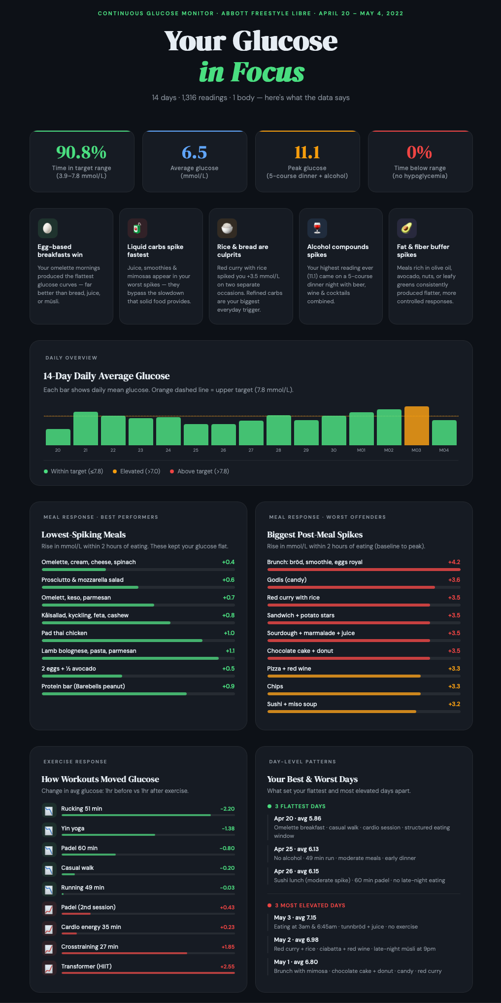
I also wanted something a little more visual, so I asked for an infographic. I did some prompting back and forth with content and layout and ended up with this.
I like the layout of this with some high-level measures at the top and the main insights below that. In the lower section, there are analysis views with different perspectives that offer more insights.
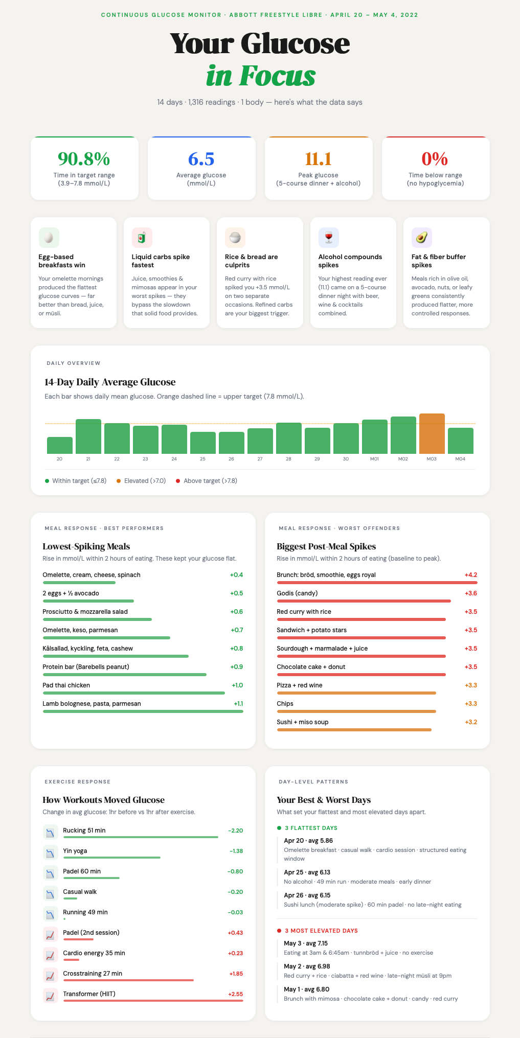
Claude is prone to dark mode graphics and I also wanted a lighter version, so I rendered this one as well.
I also had an idea that about getting Claude to adhere to a defined colour scheme. I got one I liked from Coolors.co (good colour scheme resource) and asked Claude to use it. A new rendering was made but the results were a turn for the worse so I decided not to explore this version further.
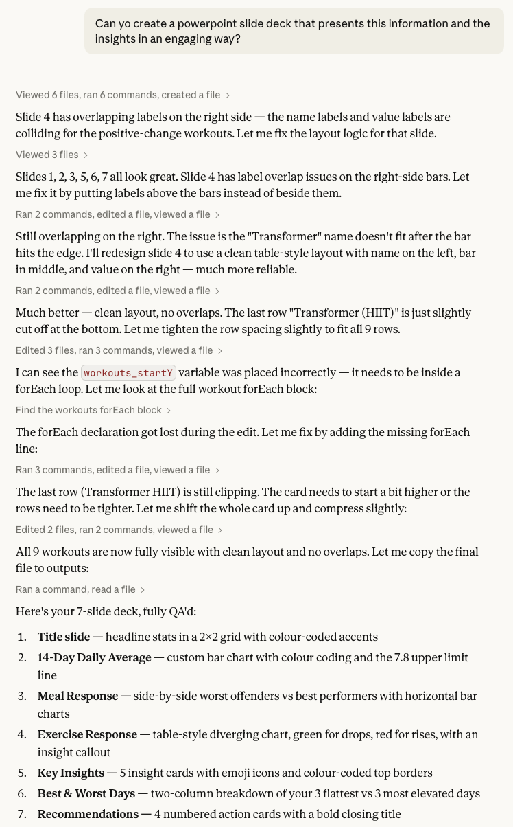
My last request was to get a slide deck with presentation materials based on the data. It defaulted back to the dark colour scheme, but I decided to stick with that. Here’s the prompt and Claude’s reasoning log.
The slides were nice, but needed some tweaking. What I really like about Claude’s PowerPoint renderings is that everything is rendered as native objects in the slides. That means that you can open them in PowerPoint and do fine-tuning.
Some thoughts around this test
I intentionally gave Claude limited instructions to see how the model would act and it did some smart things:
- Figured out that the CGM measurement units are in mmol/L.
- Set the main measure to be a rise in glucose level within 2 hours of a meal. Meaning the difference between pre meal baseline and post meal peak. This is not a trivial calculation.
- Found out what the healthy target range for glucose level is (3.9-7.8 Mmol/L).
- Set a clean and modern layout for the infographic.
- Selected some nice icons to make the key insights section more engaging.
- The infographic was rendered as artefacts that could be made public to anyone with a browser.
What I was less impressed by:
- The first visualisation that was rendered looked like something from the 90s.
- Some charts in the infographic were visually appealing but didn’t really offer any analytic value.
- The infographic artefact only saved the latest rendering, so if you want to go back to an earlier version, you have to prompt for it.
The main difference in using these later models, like Sonnet 4.6, is that they display a whole new level of intuition. You don’t need to feed it an all-encompassing prompt where you have to consider every angle in order to get a useful response. If things are left out, the model makes assumptions and those assumptions are good. It feels like you’re handing over tasks to an intelligent counterpart that can figure out a lot of things on its own. It’s also not limited to the information you upload, but can also find supplemental data to use for the analysis.
One limitation is that any change has to come via a prompt. The first version usually gets you 80% there, but the last 20% can be a frustrating back-and-forth prompt duel. A sense of prompt fatigue definitely set in in the later stages of layout work.
Another limitation from the point of view of analysis is that these tools are still non-deterministic black boxes. Will the same input give me the same response tomorrow? It’s not guaranteed. The black box properties can somewhat be assailed by getting the model to clearly define the formulas and logic it uses.
My analysis and visualisation tool of choice is Tableau and I would estimate that a similar analysis and presentation would take me more than a full day to do. With Claude, I did it in an hour. Of course, you need to add time to verify that the results are correct but that is still a lot faster than creating this from scratch in a visual analytics tool.
This was a fun experiment to do and I will keep looking at data analysis with gen AI tools, so expect more explorations in the future.